It’s the last day of the OER Visualisation Project and this is my penultimate ‘official’ post. Having spent 40 days unlocking some of the data around the OER Programme there are more things I’d like to do with the data, some loose ends in terms of how-to’s I still want to document and some ideas I want to revisit. In the meantime here are some of the outputs from my last task, looking at the #ukoer hashtag community. This follows on from day 37 when I looked at ‘the heart of #ukoer’, this time looking at some of the data pumping through the veins of UKOER. It’s worth noting that the information I’m going to present is a snapshot of OER activity, only looking at a partial archive of information tweeted using the #ukoer hashtag from April 2009 to the beginning of January 2012, but hopefully gives you an sense of what is going on.
The heart revisited
I revisited the heart after I read Tony Hirst’s What is the Potential Audience Size for a Hashtag Community?. In the original heart nodes were sized using ‘betweenness centrality’ which is a social network metric to identify nodes which are community bridges, nodes which provide a pathway to other parts of the community. When calculating betweenness centrality on a friendship network it takes no account of how much that person may have contributed. So for example someone like John Robertson (@KavuBob) was originally ranked has having the 20th highest betweenness centrality in the #ukoer hashtag community, while JISC Digital Media (@jiscdigital) is ranked 3rd. But if you look at how many tweets John has contributed (n.438) compared to JISC Digital Media (n.2) isn’t John’s potential ‘bridging’ ability higher?

Here is the revised heart on zoom.it (and if zoom.it doesn’t work for you the heart as a .jpg
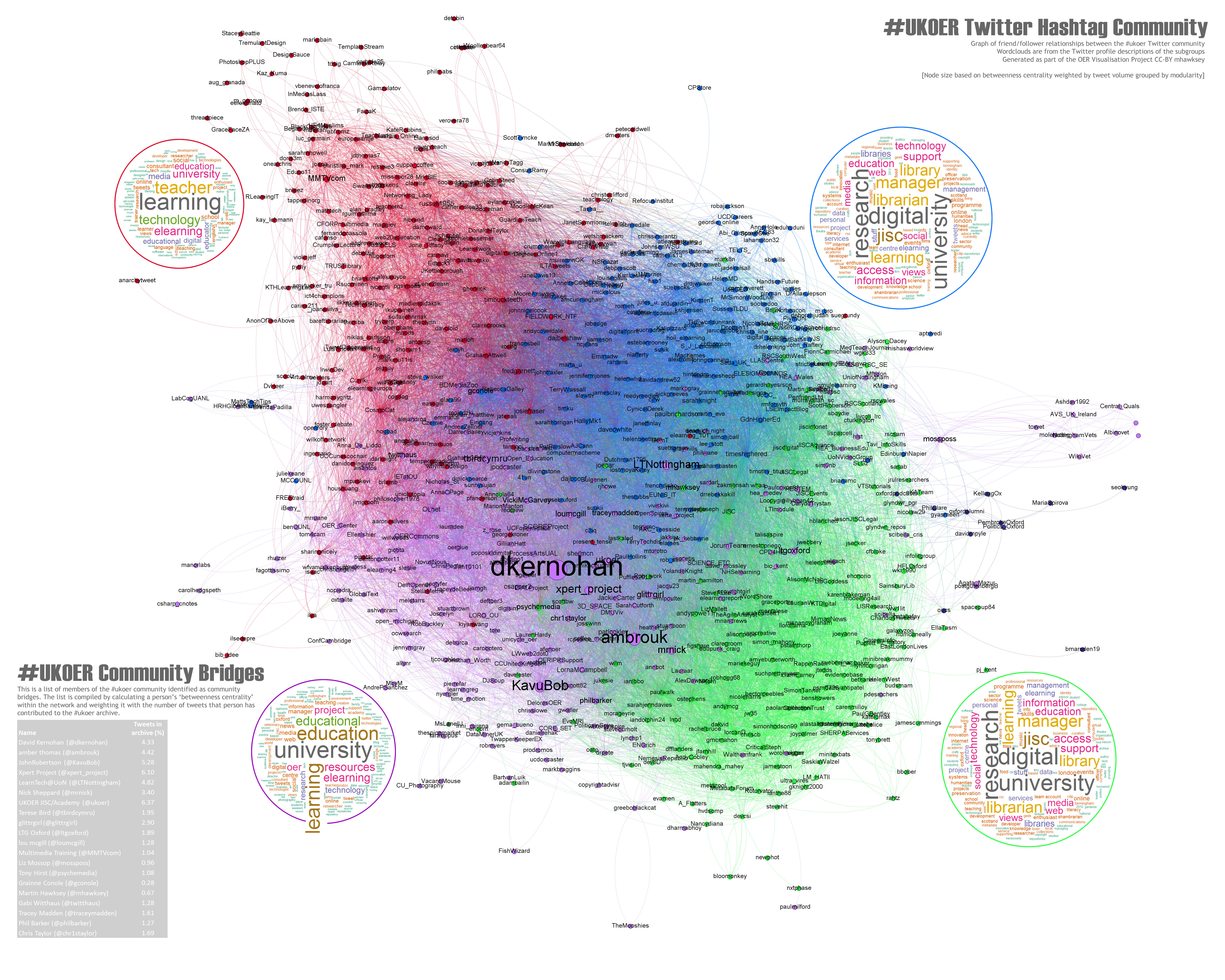
[In the bottom left you’ll notice I’ve included a list of top community contributors (based on weighted betweenness – a small reward for those people (I was all out of #ukoer t-shirts).]
These slides also show the difference in weighted betweenness centrality (embedded below). You should ignore the change in colour palette, the node text size is depicting betweenness centrality weight [Google presentation has come on a lot recently – worth a look at if you are sick of the clutter of slideshare]:
The ‘pulse’ of #ukoer
In previous work I’ve explored visualising Twitter conversations using my TAGSExplorer. Because of the way I reconstructed the #ukoer twitter archive (a story for another day) it’s compatible with this tool so you can see and explorer the #ukoer archive of the 8300 tweets I’ve saved here. One of the problems I’m finding with this tool is it takes a while to get the data from the Google Spreadsheet for big archives.

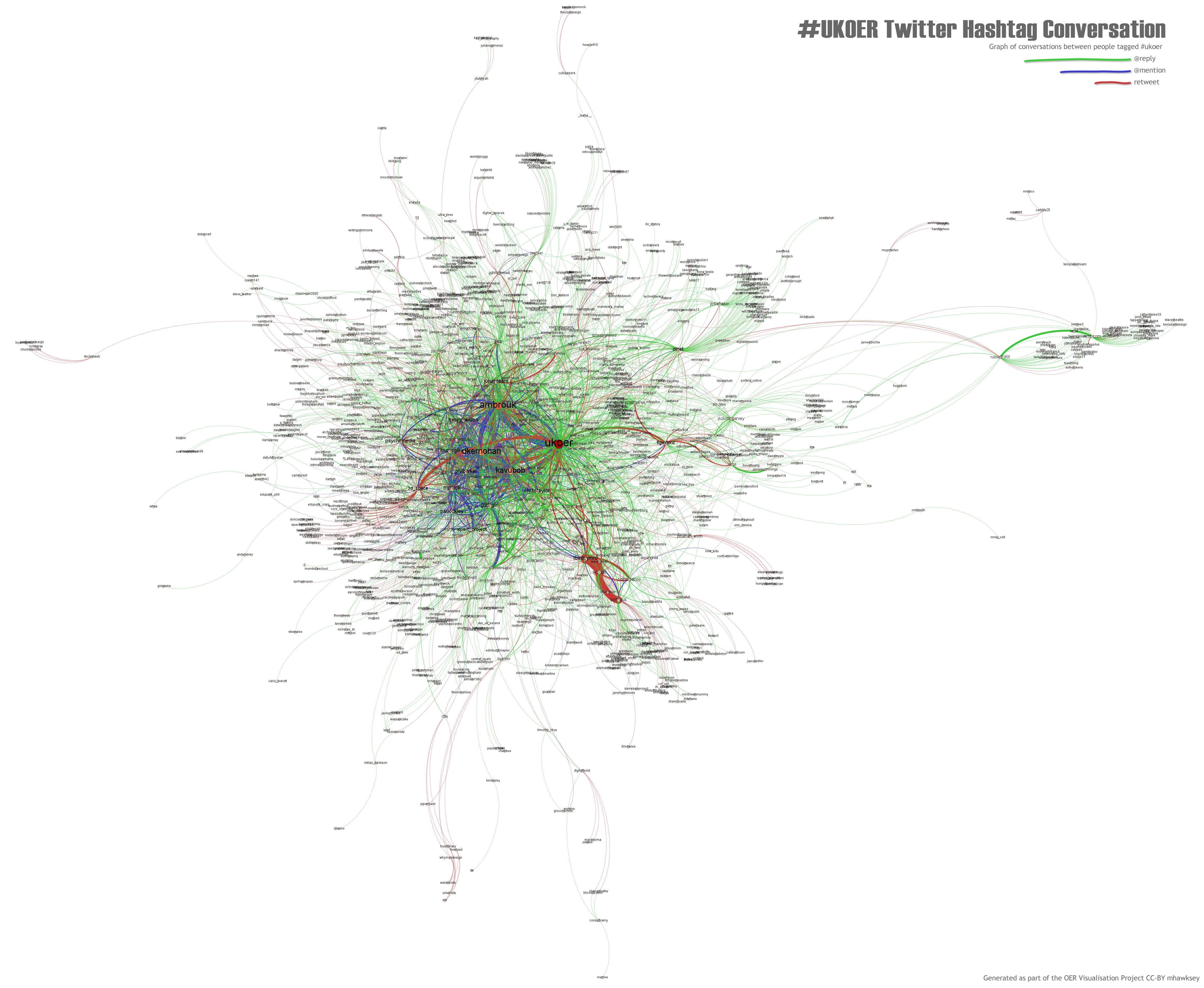 Processing the data in Gephi you get a similar ball of awesome stuff (ukoer conversation on zoom.it | ukoer conversation .jpg). What does it all mean I hear you ask. These flat images don’t tell you a huge amount. Being able to explore what was said is very powerful (hence coming up with TAGSExplorer). You can however see a lot of mentions (coloured blue and line width indicating volume) in the centre between a small number of people. It’s also interesting to contrast OLNet top right and 3d_space mid left. OLNet has a number of green lines radiating out indicating @replies indicating they are in conversations with individuals using the #ukoer tag. This compares to 3d_space which has red lines indicating retweets suggesting they are more engaged in broadcast.
Is there still a pulse?

The good news is there is still a pulse within #ukoer, or more accurately lots of individual pulses. The screenshot to the right is an extract from this Google Spreadsheet of #UKOER. As well as including 8,300 tweets from #ukoer it also lists the twitter accounts that have used this tag. On this sheet are sparklines indicating the number of tweets in the archive they’ve made and when. At the top of the list you can see some strong pulses from UKOER, xpert_project and KavuBob. You can also see others just beginning or ending their ukoer journey.
The good news is the #ukoer hashtag community is going strong December 2011 having the most tweets in one month and the number of unique Twitter accounts using the tag has probably by now tipped over the 1,000 mark.

There is more for you to explore in this spreadsheet but alas I have a final post to write so you’ll have to be your own guide. Leave a comment if you find anything interesting or have any questions
[If you would like so explorer both the ‘heart’ and ‘pulse’ graphs more closely I’ve upload them to my installation of Raphaël Velt’s Gexf-JS Viewer (it can take 60 seconds to render the data). This also means the .gexf files are available for download:]
OER Visualisation Project: Fin [day 40.5] – MASHe
[…] the visualisation are a summary of that sub-groups Twitter profile descriptions [day 37, revisited day 40]. Type: Image/Interactive web resource Link: […]
Lorna M. Campbell
This is completely fascinating Martin! There’s so much information here though that my poor head feels like it’s about to implode! I am going to have to re-read this post in stages to absorb the information :}
One question though…when you re-calibrated the betweenness centrality of individual tweeters every rating changed except David K’s. Any idea how to account for that?
Martin Hawksey
Hi Lorna – yes a lot to take in 😉 David remained top because not only did he have the top original betweenness centrality but he was also the top contributor.
Martin
dkernohan
I think we know the reason for that! #ukoer #4life
Jonas
Hi Martin,
just found your really helpful way of exporting the relevant visualization data.
So after I’ve already bugged you several times w/r/t how to use your Google spreadsheets, it’s now about time to ask you how I get those data into Gephi 🙂
Sooo: I’ve got the raw data (Source,Target,Tweet Type) as plain text but don’t know how to import it in Gephi. If I create a .csv file in Sublime and open it in Gephi I have a network, but unfortunately it also includes the main actors Retweet and Answer. This is, of course, something, I’d like to get rid of. My question is how I properly import the plain text to Gephi in a manner that it actually shows the “real” network? Am I on the right track or should I import the plain text in a different application or is there something else I’m not seeing at all?
Thanks for your very very cool and helpful tools!
Jonas