This is my first ever attempt at ‘live blogging’ and haven’t done any tidying other than cropping images. You might want to explore the LASI-UK a twitter summary by @sheilmcn (complete #lasiuk twitter archive here)
Giles Carden (University of Warwick)
Good data visualisations solve real business problems
[Slides here http://www.solaresearch.org/wp-content/uploads/2013/05/G-Carden-LASI-UK-Data-Visualisation.pptx]
Covering key components for effective data visualisation. Informed by Stephen Few’s work using the following principles
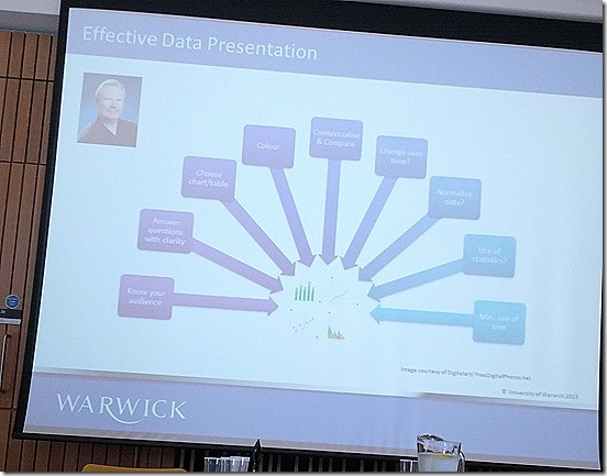
Clarity important (forget the 3d charts). Using colour to indicate type of document.
Using different chart types for different audiences (senior management and individual academics seem to get simpler charts)
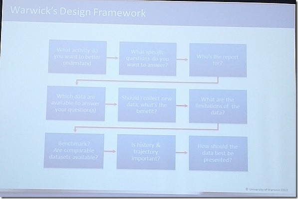
Warwick design framework
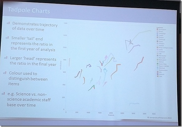
Some examples of charts used at Warwick (not commonly used elsewhere)
Using ‘tadpole’ chart to add time dimension (tails = older results)
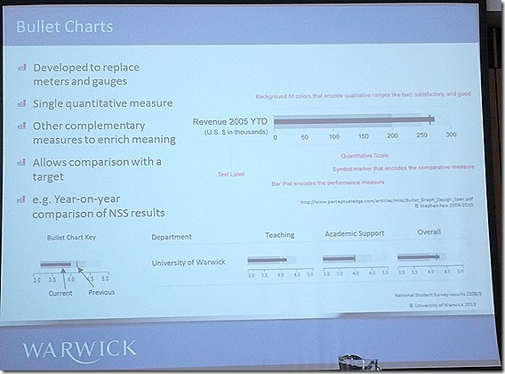
Bullet chart
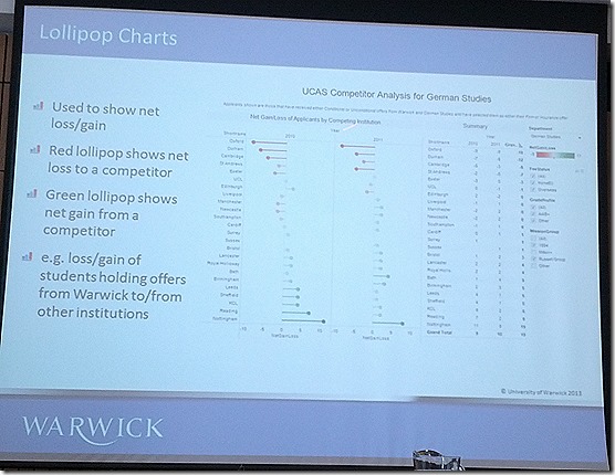
Lollypop chart used to show student loses/gains
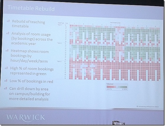
Visualizing estates usage (red = underutilized) limited to teaching and learning. Became very apparent lack of estate usage in term 3 in part a consequence of final exams scheduling.
“good data visualization removes the need for extensive narrative”
Q: how do you get your data?
A: national resources and data warehouse. Culturally hasn’t been much resistance. Also has a known face people seem more willing to share their data.
Better to have 80% of the data now than 100% in a years time
Q: visual literacy of senior management
A: thirst for data, variations as some academic backgrounds already have these literacies. Most people seem to get it. Mantra is to make it simple
Chris Ballard (Tribal Labs)
Data visualisation with predictive learning analytics
[Slides here http://www.slideshare.net/ChrisBallard/data-visualisation-with-predictive-learning-analytics]
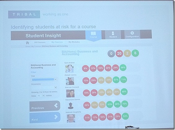
Background: work has come out of a R&D with University of Wolverhampton. Looking at student success and retention going beyond the traffic light system. Interested in how staff interpret predictive visualisations. Using historical and current data combined with an understanding of student learning to provide insight. Different ways of using predictive analytics in learning analytics including student success, recommendation systems.
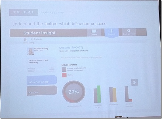
Understanding the student factors that influence student success. Focus is to help staff support students (maintaining a human interface). Requirement to make actionable insights.
Issues with predicting
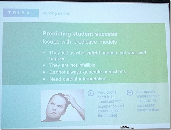
Telling you what might happen and not will happen. Highlighting fallibility and need careful interpretation
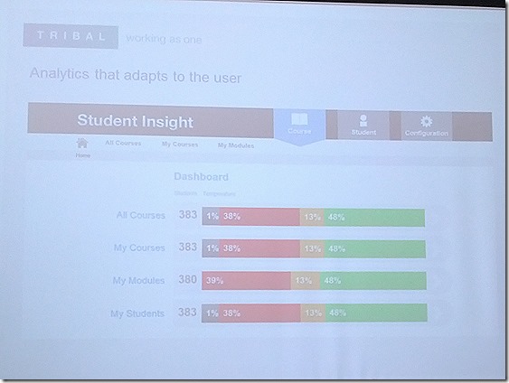
Focusing on presenting data to staff. Delivering to a wide range of staff, want to present data appropriate to viewers need. Using logging to filter eg if tutor your students prediction, course leader students + module level
Staff can drill down into courses. Ability at a glance to see summary of module. Drilling down to student view
Giving an indication of the areas where student might be struggling
Using metrics that have shown to have a strong influence in student success: Preparation for HE, engagement (engagement including vle and library use) and academic integration (formative assessment results)
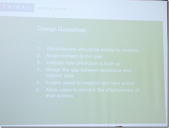
Design guidelines
Technology guidelines – highlight cross platform and touch friendly interfaces
Design considerations – ‘traffic lights’ are very emotive and have distinct colour banding (granularity)
Q: about prediction drilldown
A: very difficult to go beyond a certain level. Need to explain what ‘36% VLE engagement’ actually means.
Em Bailey (Heriot-Watt University)
An overlooked tool? Using Excel for advanced data visualisation
All these shiny toys and here to defend the Excel. Benefits, very powerful and flexible and already on most people’s desktops.
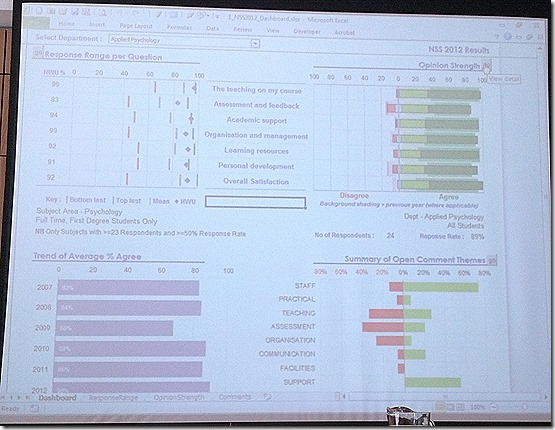
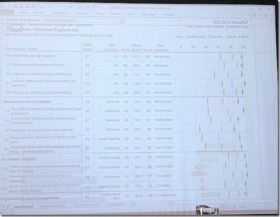
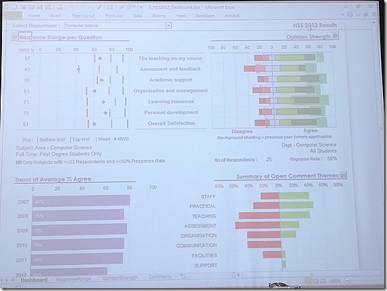
NSS survey dashboard presented in Excel developed by Em. No macros or VBA and using built in charts. Mix of subject and department information. Users can pick different subjects
Option to drilldown for response range and opinion strength and make sector comparisons
Looking at when things not going so well
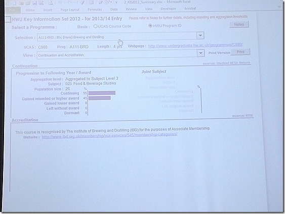
Used Excel to mock up what Key Information Set data might look like. Used to all staff to validate their returns.
Sheila’s work blog » LASI-UK a twitter summary
[…] back channel to provide a summary of the day. Martin Hawksey also live blogged the morning and afternoon […]
Notes on liveblogging (never again) Jisc CETIS MASHe
[…] LASI-Local, I thought I’d give liveblogging a go. You can see the two posts I captured here and here. Overall I’m disappointed with the result but thought worth reflecting on the process and […]