Graphs can be a powerful way to represent relationships between data, but they are also a very abstract concept, which means that they run the danger of meaning something only to the creator of the graph. Often, simply showing the structure of the data says very little about what it actually means, even though it’s a perfectly accurate means of representing the data. Everything looks like a graph, but almost nothing should ever be drawn as one. Ben Fry in ‘Visualizing Data’
I got that quote from Dan Brickley’s post Linked Literature, Linked TV – Everything Looks like a Graph and like Dan I think Ben Fry has it spot on. When I started following Tony’s work on network analysis (here’s a starting point of posts), my immediate response was ‘Where’s Wally?’, where was I in relationship to my peers, who was I connected to, or even who wasn’t I connected to.
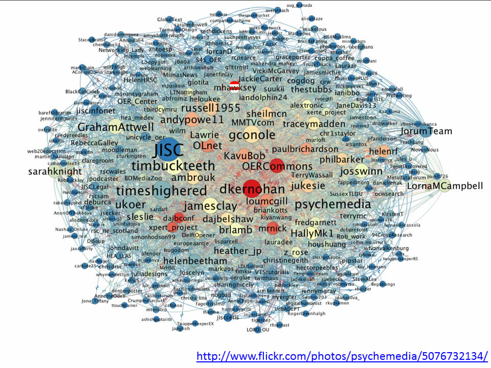
As I start my exploration of tools like NodeXL it’s very clear that being able to filter, probe and wander through the data provides far more insights to what’s going on. This is why when I, and I’m sure Tony as well, show our tangled webs it’s designed as a teaser to inspire you to follow our recipes and get stuck into the data yourself. This isn’t however always practical.


But what does this graph actually mean? I could start highlighting parts of the story, but that would be my interpretation of the data. I could give you the NodeXL file to download and look at, but you might not have this software installed or be proficient at using it. I could try looking at the raw data in the Google Spreadsheet, but it lacks ‘scanability’. So I’ve come up with a halfway house. A re-useable interface to the TAGS spreadsheet which starts presenting some of the visual story, with interactivity to let you drilldown into the data. I give you:

<a href="https://hawksey.info/tagsexplorer/?key=0AqGkLMU9sHmLdDJYMDZYR3FUcnVwWTkwLWpScnFIUXc&gid=73&mentions=true
What is TAGSExplorer?
TAGSExplorer is a result of a couple of days code bashing (so a little rough around the edges) which mainly uses the DataTable part of the Google Visualization API to read data from a TAGS spreadsheet and format it to use with d3.js graphing library. By chucking some extra JavaScript/JQuery code (partly taken from johman’s Twitter Smash example) I’ve been able to reformat the raw Twitter data from the Google Spreadsheet and reformat it returning Twitter functionality like reply/retweet by using their Web Intents API.
What is displayed:
- A node for each Twitterer who used the #studentexp hashtag and is stored in the spreadsheet archive.
- Solid lines between nodes are conversations eg @ernestopriego tweeted “@easegill I agree completely. Learning how to use social media tools is part of digital literacy and fluency; part of education. #studentexp” creating a connection between @ernestopriego and @easegill.
- Dotted lines are not direct replies but mentions eg @theREALwikiman tweeted “If you’re an academic librarian it might be worth following @GdnHigherEd‘s #studentexp tag right now, if you have time. Interesting stuff.” For performance by default these are turned off but enabled by following the instructions below.
- Node text size based on he number of @replies and @mentions
How to make your own?
- If you haven’t already you need to capture some tweets into a TAGS spreadsheet
- When you have some data from the spreadsheet File > Publish to the web …
- Head over to TAGSExplorer and enter you spreadsheet key (or just paste the entire spreadsheet url HT to Tony Hirst for this code)
- Click ‘get sheet names’ and select the sheet of the data you want to use (if you are doing a continuous collection the default is archive)
- Click ‘go’
- If you want to share with others, click the ‘link for this’ at the top right which gives you a permanent url – the permanent link also hides the spreadsheet selection interface. By default mention lines are off but can be enabled by adding &mentions=true to the link (see example above)
Some examples
If you don’t have your own data yet here’s some examples from data I’ve already collected:
Where next?
I’ve got some ideas, I’m interested in integrating the sentiment scores from ViralHeat, but more importantly where do you think I should go next with this?
Visualising the #ili2011 Twitter archive « MASHe
[…] and pull the data into a more readable shape. You can read more about the technology behind this in TAGSExplorer: Interactively visualising Twitter conversations archived from a Google Spreadsheet and also discover how you can visualise your own Google Spreadsheet of tweets.PS In Brian’s post […]
Tony Hirst
Martin -that is just magical….
I think you’ve hit on a really powerful recipe here… I guess what’s needed to lower barriers is some way of allowing folk to browse headings from a Google spreadsheet, select to/from columns, then generate a stub of code (or URL parameter setting, handled within the page?) that will generate the map from the appropriate s/sheet and cols?
So eg a browser that will accept a URL for a spreadsheet, show you the column headers, let you select to/from nodes and then generate eg
example.com/tagbrowser?key=SPREADSHEETKEY&gid=SHEET&fromCol=C&toCol=F
(I guess for generality you might also allow an arbitrary query to be passed in to filter the data down?)
Martin Hawksey
less is always easier than more. It would be a nice entry level get stuff off your desktop Gephi/NodeXL and into the cloud type tool. Unfortunately I’m blinded by more, more, more it must do more . You should have a go at that one though 😉
Ta,
Martin
Martin Hawksey
… and here it is a tool to visualize edge data http://mashe.hawksey.info/2011/11/edgesexplorer-simple-force-layout-diagrams-from-edge-lists-stored-in-google-spreadsheets-nodexl-gephi/
EDGESExplorer: Simple force layout diagrams from edge lists stored in Google Spreadsheets [NodeXL Gephi] – MASHe
[…] TAGSExplorer to the world one of the initial reactions I got was from my friend Tony Hirst who suggested having a simple version which let users select two columns to generate a force layout diag… (that’s what I think he was suggesting anyway ;).I’ve played around with other ways to get […]
40 days to let you see the impact of the OER Programme #ukoer [day 1] – MASHe
[…] Spreadsheets include a number of visualisation options which can be embedded elsewhere, and as in my TAGSExplorer the data can be read and visualised using other visualisation libraries. CETIS also already have […]
Engage, review, repeat: Using metrics to improve your Twitter engagement « mmit blog
[…] if you’re *really* into visualisation tools, check out TAGSExplorer, a brilliant tool created by Martin Hawksey that lets you create interactive visualisations of your […]
The Picture Friendly Guide on How to Use Twitter
[…] exclusive emails [image credits to Martin Hawksey and Lucian Milasan] Tags: guide, how to, twitter, use ← Who Else Wants Thousands of […]
The most comprehensive aggregation and visualisation of #jiscel12 tweets JISC CETIS MASHe
[…] [TAGSExplorer: Interactively visualising Twitter conversations archived from a Google Spreadsheet] […]
TAGSExplorer now includes filterable/searchable archive JISC CETIS MASHe
[…] via a separate web interface for some time but I’ve never got around to publicizing it. As TAGSExplorer also uses the Google Visualisation API to wrap the same data in a different visualisation tool […]
Infobib » Archiviert und visualisiert: die Tweets zum #cch12
[…] Martin Hawksey ist ein begnadeter Frickler und stellt zusätzlich zu seinem Archivierungstool (das auch ein paar einfache Analysefunktionen mitbringt) auch eine Visualisierungskomponente zur Verfügung: den TAGSExplorer, dessen Output im ersten Screenshot zu sehen ist. Auch diesen und dessen Anwendung beschreibt er Schritt für Schritt. […]
LAK13: Recipes in capturing and analyzing data – Twitter Jisc CETIS MASHe
[…] TAGSExplorer: Interactively visualising Twitter conversations archived from a Google Spreadsheet […]